EXPERIENCE
Autohero
complete re-design of a second-hand car online dealer
Role: Key UX/UI Designer | Time: May 2020 - present
On July 9th 2020, at around 10 PM, I received an unexpected message from my then director at Auto1 Group. Despite being a recent hire and having been put on Kurzarbeit due to the pandemic, I was about to embark on a significant journey with the company. In this case study, I will guide you through the intense, challenging, yet incredibly rewarding 5-day process that laid the groundwork for the Autohero we know today.
Day 0: Getting Acquainted
It was a room full of company leaders, all of whom I hadn’t met before, and there I was—the only non-leader in the task force. This challenge was twofold. Firstly, Autohero was navigating the pandemic, like many others, and searching for a solution to sustain the business. Secondly, as a new member of the company and the only non-leader in the room, I felt the pressure acutely. The air was thick with anticipation, but this mix of fear and excitement became the driving force behind my contribution to the project.
Our primary goal was clear: Create an online car buying experience that allows customers to confidently purchase a vehicle without physically viewing it.
Background and Strategic Fit
The current autohero customer experience was still fulfilling the original intended vision of a Classifieds marketplace but certain website elements, such as the checkout feature, have already begun transitioning our customers into an online shopping experience. As a crucial part of Auto1 Group's future expansion, it is pivotal for Autohero to distinguish itself in the market through a superior online showroom experience.
The Objective
Our primary goals for this project were to produce two main deliverables:
A Design Prototype Showcasing the Core Customer Journey
Purpose: This prototype is intended to illustrate the foundational path a customer takes through the Autohero platform. It will act as a visual guide for stakeholders and the development team, demonstrating the steps a user needs to take from landing on the site to engaging with car details.
Features: Interactive mockups, wireframes, and animations that illustrate the various stages of the user journey.
A Working Prototype of an Immersive Car Details Experience
Purpose: This prototype aims to provide a dynamic and comprehensive view of individual car listings. It is designed to give customers a rich, in-depth understanding of the car they are interested in, mimicking the experience of physically examining a car.
Features: 360-degree car view, detailed specifications, photo and video galleries, and interactive features allowing users to explore car details visually.
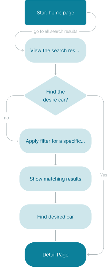
The User Flow
We envisioned a seamless, intuitive process for the user, outlined in the following flowchart:
As the only non-leader and still in my probation period, I felt somewhat inadequate, but I was surprisingly invited to share my design perspective by one of the VPs. I fondly (and somewhat cringingly) remember describing our need for a “sexy design”—an aesthetically pleasing design that would capture the fascinated attention of our users and everyone was laughing. It was a candid moment, but one that set a tone of genuine collaboration and warmth among the team.
Day 1: Sketching the Blueprint - Wireframes
Today marked my first official day working closely with the entire team, including direct collaboration with the Product Director and Marketing Director. The atmosphere was charged with energy and focus - we were all aligned with the mission at hand. As a newer member of the team, the stakes were high, but so was the anticipation.
Today's mission: Create wireframes for all three essential pages—Homepage, Search Page, and Detail Page with Detail Page being the most important deliverable.
Crafting Our Unique Path
In order to reimagine the Autohero experience, we knew we had to set certain guiding objectives:
Swift Customer Journey
Keep the customer's journey towards the Car Details Page swift and straightforward.
Building Emotional Connection
Enable customers to build a visual and emotional connection through high-quality images and immersive media, avoiding overloading them with information.
A Fresh, Modern Approach
Strive for a clean, modern experience that moves away from the 'classified ad' style, opting not to mimic platforms with a similar model.
Thoughtful Use of Color and Space
Make thoughtful use of branded colors, and aim for a wide layout that utilizes space effectively without clutter.
Letting the Car Image Shine
Let the car’s image be the star, letting it do most of the convincing, with less reliance on detailed information about the car.
Setting the Scene for Each Page
Homepage
A wider, full-width page layout designed to engage visitors with rich, full-width content and a striking primary image.
Search Page
A wider, full-width layout with a grid view to spotlight the cars. The design prioritizes key information through larger, prominent car images.
Car Details Page
A layout focused on immersive, high-quality content. Here we planned for video, 360-degree interior views, and still images that would capture the car's essence and encourage a deeper connection.
Sketches: Setting the Stone for Day 2
By the end of Day 1, after a constant feedback loop and three review meetings with the Senior VP, we settled on a low-fidelity wireframe that would serve as a stepping stone for the next day: Day 2.
As we moved forward with a clear, independent vision, we found ourselves pondering:
Do we have design examples of what should be avoided in this new direction?
How can we strike the balance between immersive visuals and essential information?
Day 2: Refining the Vision
Today began with a team stand-up, laying out the progress we made, discussing the blockers ahead, and setting the stage for a productive feedback round based on yesterday's wireframes. It was a day marked by detailed discussions and key decisions.
Today's mission: Create the first rough draft to be shared with the stakeholders to determine which direction we want to take.
Morning Brief: Setting the Day's Queries and Goals
During our stand-up, we raised critical questions and laid out our goals for each page:
Homepage:
Attention Gainers: What will be our powerful first touchpoint?
Type of Widget: Just CTA vs. Search Bar vs. Select?
Explaining the Process: What are the steps to elucidate to customers how ordering through Autohero works?
Search Page:
Image Presentation: Design a version with 16x9 images on the card?
User Interface Elements: Remove location/sorting from the design?
Filters and Search: No multi-select in the function? Keyword search not in prototype scope?
Car Details Page:
Engagement: Contact Form or an advanced “Helper Chat”?
Conversion Strategy: How quickly should we push a conversion section, before or after key features?
Diving Deep into the Detail Page
After the review, it became evident that the detail page demanded more attention and time. The various media types—images, videos, 360 views, imperfections—each carry a complexity that we had to address to provide a cohesive, intuitive, and engaging user experience.
Crafting a Visual Story
The car is not just a vehicle; it’s an experience, a story. We spent time debating:
How to Best Use Imagery: The positioning and sequence of images, videos, and 360-degree views to construct a narrative for each car.
Highlighting Imperfections: The challenge of displaying imperfections clearly without overshadowing the car's appeal.
Media Interaction Design
Intuitive Navigation: The icons and controls needed to be instinctive and minimal. We sketched and debated various navigation icon designs.
User Choice: Enabling users to select specifically what they want to see—imperfections, exterior, interior, highlights—and how to signal this choice clearly.
Maintaining an Immersive Experience
Eliminating Distractions: We worked on removing unnecessary elements that might pull focus from the car itself, discussing what secondary information is essential and what could be deprioritized or removed.
Considering Thumbnail Placement: For gallery views, deciding between hiding thumbnails until needed, using a filmstrip layout, or other novel approaches.
Conversion Elements: Striking the Right Balance
Engagement vs. Hard Sell: A key discussion was where and how to introduce ‘conversion’ elements. How do we gently guide a user toward making a contact or purchase without feeling rushed or pressured?
Day 3: Progressing to High-Fidelity
Today began with our usual morning stand-up, where designs were thoroughly reviewed by the Product and Marketing to ensure alignment on our direction. After the meeting, the decision was clear: though the mid-fidelity wireframes weren’t fully settled, we had enough feedback and guidance to confidently move to the next stage: hi-fidelity design. Here, decisions were made regarding what content and imagery each page should prioritize, leading to further refinement of the design's focus.
HOMEPAGE
Crafting the Narrative
Focus on Story
Design hub elements that vividly describe the product
Explore and consider industry best practices
Incorporate USPs (Unique Selling Propositions) and customer testimonials
Strategize improved video integration across the platform, possibly featuring a video in the main marquee instead of a static image
SEARCH PAGE
Refining the Browsing Experience
Structural Decisions
Opt to make the H1 smaller and left-aligned to free up space for two rows of cards
Design the filter and sort-by sections
Refine the styles for the card details
Decide on the positioning of the YEAR in the headline – whether to follow the format (Make Model Year) or present it as a detail
SEARCH PAGE
Enhancing the User’s Deep Dive into Each Car
Media Engagement
Revisit the design of media toggles
Integrate imperfections directly within the gallery
Remove the black line/slider
Display media controls openly on the first load
Experiment with autoplay for videos on the first load
Explore behavior when loading multiple images in the gallery
Directing User Actions
Add a prominent CTA for “Contact Us,” accompanied by a phone number
Trimming and Clarifying
Decide on the necessity of the efficiency class section—keep or remove?
Omit the call-back contact section
Evaluate the need for a separate car condition section—retain or discard?
Reaffirming Value
Integrate USPs (Unique Selling Propositions) clearly and compellingly into the page
By the end of Day 3, our aim is to have moved closer to high-fidelity designs with a strong alignment with our brand's voice and vision, and with clear paths for the user to journey through our platform.
Day 4: Gearing Up for the Final Stretch
The clock was ticking. The fourth day dawned with a critical objective: to ensure that a minimum of 80% of our design for the three screens was ready. We were aware of the looming deadline: the developers were set to start building the demo. Day 4 was a symphony of collaboration, precision, and execution. Our task? To deliver high-fidelity screens replete with finalized content while ensuring all assets were primed for export.
Facing the Challenges: Realistic Data and Functional Design
Our challenge was two-fold:
1. Harmonizing Authentic Data with Design
- 1
Data Integration
Seamlessly integrating realistic data into the design without disrupting aesthetics.
- 2
Consistency
Maintaining data uniformity across all screens to uphold brand credibility.
- 3
Relevance
Ensuring the displayed data was up-to-date and pertinent for the audience.
2. Crafting a Functionally Elegant Design
- 1
Intuitive Navigation
Guiding users effortlessly through their journey on the platform.
- 2
Mobile Responsiveness
Ensuring the design adapts seamlessly across various devices.
- 3
User Engagement
Creating an engaging experience that reduces drop-offs and promotes interaction.
HOMEPAGE
The Gateway to Autohero
The homepage is often the cornerstone of any digital experience. For Autohero, it needed to be more than just an entry point; it had to embody our brand, communicate our value proposition, and guide our users seamlessly.
Challenges
- 1
Striking the right balance
Should we provide a fast-track entry through a CTA or a search button for the users?
- 2
Consistency
Introducing the brand and product seamlessly.
- 3
Brand awareness
Explaining the "Autohero advantage" to the first-time, uncertain users.
Challenges
- 1
Emotional Touchpoint
Choosing between truck-centric visuals versus more human-centric ones.
- 2
Call to Action
Challenging the idea of a simple CTA or a direct entry point into the car exploration.
- 3
Bellow the Fold Content
Clarifying the benefits of partnering with Autohero and the operational mechanics.
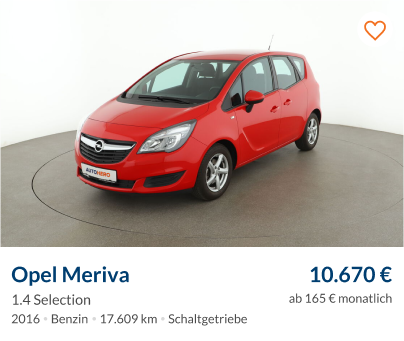
SEARCH PAGE
The Visual Showcase
Autohero's search page is at the intersection of user aspirations and our offerings. It’s where potential becomes tangible, and broad interest transforms into specific intent. Getting the design and functionality right was pivotal.
Car Tile Behavior: Decisions Ahead
Central to our search page revamp was how car listings would be presented:
- 1
Pagination
This method divides listings into clear 'pages'. It provides users with a defined search structure, and it also offers space for additional content below the tiles.
- 2
Infinite Scrolling
Offering a seamless browsing experience, this approach lets users continuously scroll through listings. It's smooth but risks burying essential content at the bottom.
Our challenge was to decide which approach better aligned with our users' intentions and the platform's goals.
Vision for the Search Page
- 1
Dynamic Discovery Hub
Not just a listing space, but an interactive zone where users can explore and discover.
- 2
Catering to All
Serve both decisive buyers and casual browsers by intuitively guiding them to relevant choices.
- 3
Fruitful Journey
Whether a user is window-shopping or on a targeted hunt, their experience should be streamlined and satisfying.
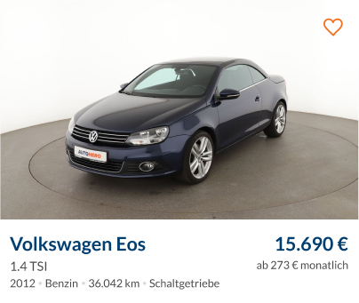
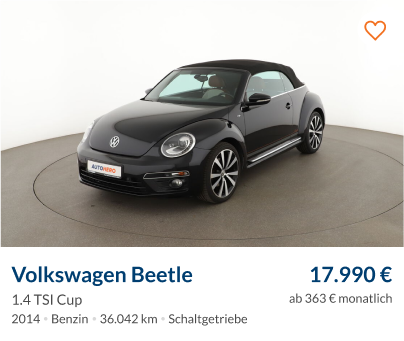
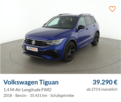
DETAIL PAGE
Deep Dive into the Detail Page
The Detail Page represents the moment of truth for users. It's the space where contemplation meets decision-making. This page had to be meticulous, providing an immersive experience without overwhelming the user.
Holistic Car Experience
- 1
Media Challenges
A critical challenge was the presentation of these media forms. The videos, predominantly in 16:9 aspect ratio, posed sizing issues. We wanted the conversion area (the section prompting users to take action like contacting the seller or checking out) to remain above the fold while ensuring that media remained fullscreen. Collaboration was key, and I worked intensively with the brand VP, adjusting and resizing until we achieved a compatible display for every breakpoint.
- 2
Multiple Media Types
Integrating different forms of media like 360-degree views, videos, and high-resolution image galleries meant users could virtually experience every facet of the car.
Essential Elements of the Detail Page
- 1
Car Essentials
Car title, price, and potential savings should be instantly visible.
- 2
Direct Converting Option
A strategically placed Call to Action (CTA) that propels users toward the purchase or inquiry process.
- 3
Full-Screen Car Experience
This involves the showcasing of videos, the 360-degree interior, and the image gallery, which also includes a detailed look at imperfections.
- 4
Highlight Key Features
Displaying the standout features of a car can be a deal clincher.
- 5
Dive into Details
An expandable list showcasing the equipment and accessories the car comes with.
- 6
Quality Assurance
A segment dedicated to the quality checks the car has undergone, outlining any fixes or refurbishments.
- 7
Financing Options
Providing users with financial solutions directly on the page.
- 8
Contact Form
A debated element. Should users be given an avenue for direct inquiry on the page?
- 9
Recommendations
A carousel or a strip showcasing similar cars can keep users engaged and offer more options.
Day 5: Presentation Day
Day 5 was the culmination of a relentless week of work, brainstorming, feedback, and iterations. With the weight of expectations looming, our day started with last-minute content and design adjustments. By noon, design changes ceased, allowing us a few hours of preparation before the big presentation at 4 PM.
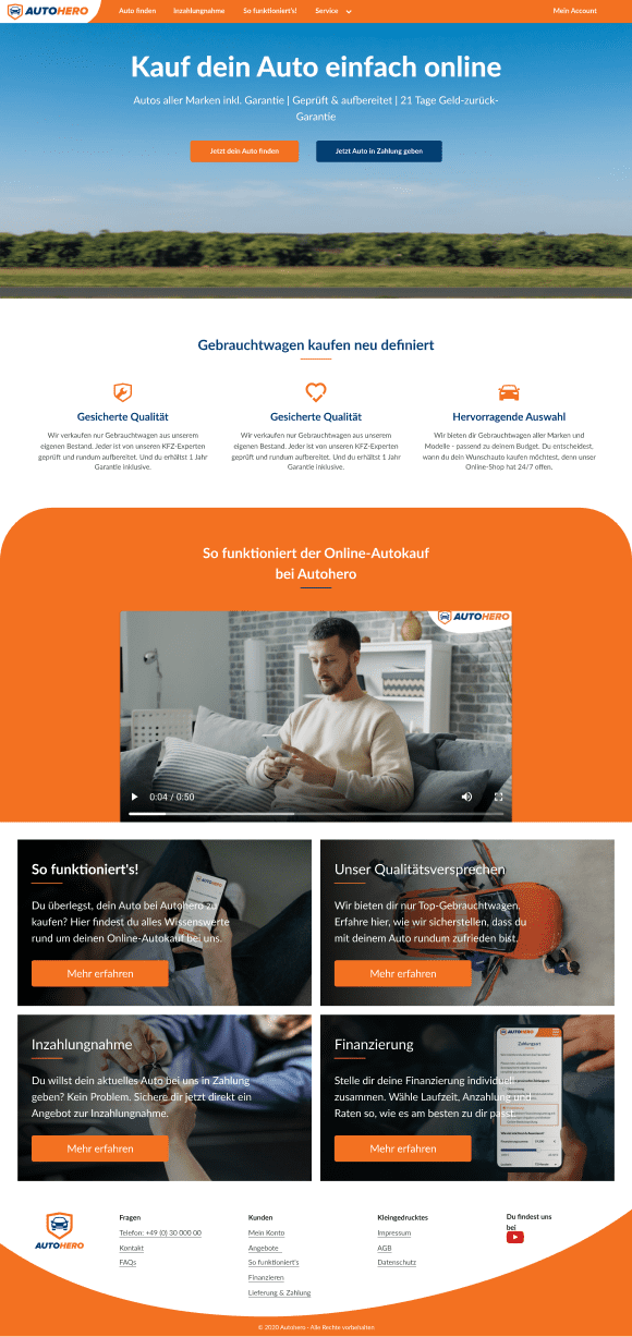
The feedback post-presentation was a testament to our hard work - it was overwhelmingly positive. This 5-day design sprint was just the dawn of the Autohero we recognize today. Focusing primarily on desktop solutions during this week, we wanted users to have a comprehensive and immersive car detail experience.
Homepage Insights
Goal-Gradient Effect: As users get closer to their goal, their enthusiasm increases. Our homepage was designed as an inviting space for users to familiarize themselves with our brand without feeling overwhelmed.
Hick's Law: To decrease the decision-making time, we scrapped the search widget on the homepage, replacing it with two concise CTAs - leading to the search page and our trade-in funnel.
- Auto finden
- Inzahlungnahme
- So funktioniert's!
- Service

Mein Account
Deine Autosuche: Finde deinen neuen Gebrauchtwagen
- Marke & Modell

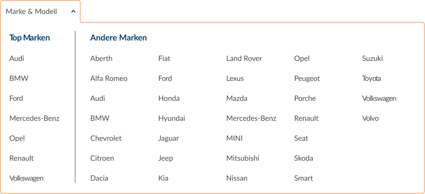
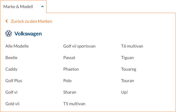
- Preis
- Erstzulassung
- Kilometer
- Detailsuche
Sortieren nach
Neueste Inserate
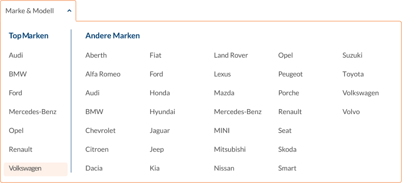
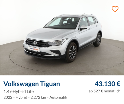
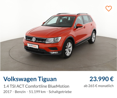
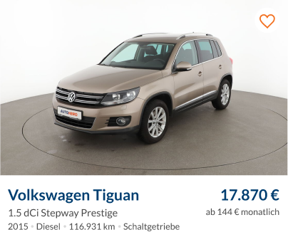
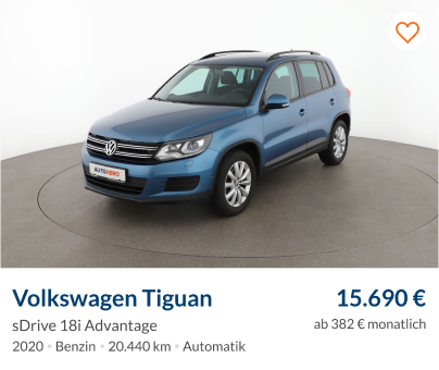
Marke: Volkswagen

Modell: Tiguan
Alle Filter löschen
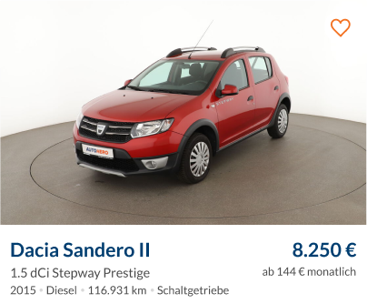
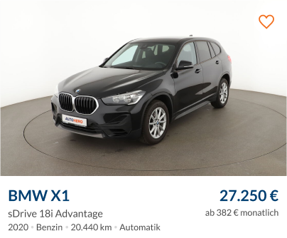
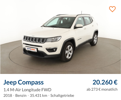
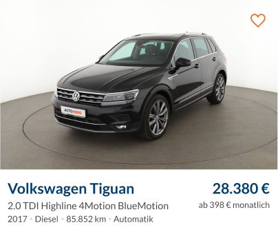
Search Page Principles
Fitts's Law: Transitioning from a classified look to a more commerce-centric one, we emphasized showcasing the cars while imparting essential information.
Aesthetic-Usability Effect: The revamped search page's aim was to be as aesthetically pleasing as functional.
Law of Common Region: To enhance user experience, we designed car tiles encapsulating all necessary details, creating a uniform visual theme to be reused across the site.
Detail Page
The detail page was arguably the most exhilarating yet demanding aspect of the project, replete with high stakeholder expectations.
- 1
Multimedia Gallery
Harmonizing different media forms (videos, 360º views, and photos) into a cohesive, navigable unit was a significant hurdle. Ensuring that different media with distinct ratios fit uniformly without losing crucial details was a nuanced challenge. Additionally, we needed an intuitive navigation mechanism that was unobtrusive.
- 2
Conversion Area
Earlier designs cluttered vital information above the fold. Our redesign was data-driven, focusing on presenting primary details prominently, compelling users toward the "Buy Now" option.
- 3
Content Clarity
A significant challenge was ensuring that our detail-rich content remained accessible and user-friendly. Our primary objective was transparency, allowing users to quickly locate essential details.
Post the sprint, our journey didn't stop. Visit autohero.com, and you'll see the transformations we undertook. New features have been added, several design changes have been made, and extensive testing has been conducted.
Take a look on my other projects